This seasons Jerseys, What you think?
- Thread starter Kevlar68
- Start date
Thread starter
#3
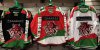
I like the fact the logos are so big. Seems a significant increase in size.
Im not sure about the diagonal bands....... looks as though they ran out of ideas for the bottom............ I'll reserve judgement until i see them on the ice.
I do like the change of font on the back though. i think the print will stand out a lot more on the ice
I do like the change of font on the back though. i think the print will stand out a lot more on the ice
i like the black one a lot, id like too buy that. red one looks good but not sure on the white flash across bottom. white one my least favourite. looks a bit weird. might look better in the flesh my feeling