3rd August
- Thread starter Wannabe2
- Start date


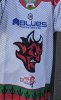
I don’t know how anyone could have seen a prototype of this and gone “Yes, that’s the one”
I don't know if it's because it's so simple, but it looks like it's missing something? Maybe the white eyes on a white background just somehow make it look worse than the black background version?
The silence of the crowd said it all for me. You could have heard a pin drop…
I hate to say this because I know that a group of people have spent a lot of time and energy on the new logo but I’m not a fan. I loved the incorporation of the word devils into the previous logo - it’s always been a touch of genius for me. There should have been a poll on this one - the logo has always been the best in the league - it didn’t need changing.
On a separate note - the enclosure on the gantry looked like a potential home for a commentating team and looks quite classy. Still no upgrade on the sound system though…
Thread starter
#190
One word for the new logo HORRIFIC, it’s a cross between the laughing cow and William Shakespeare, this shambolic mess took a 12 month apparently to design. This logo without a shadow of a doubt is the worst in the league, . People may say I am old and don’t like change, old I may be but Senile I ain’t, on the positive note it has stopped me buying shirts, and has raised the value in our older shirts with the best logo in the leagu. So sorry to sound negative but this logo is truly Horrendous, we had a season with covid to put up with, then a season with a non directional team to put up with and now this. I knew I shouldn’t have gone but like a mug I did sorry to say.
Thread starter
#193
Sums it up I think
This is the biggest cock up since the Tories elected Liz Truss as leader and PM. If this was Todd’s decision then I can only assume the man is having a midlife crisis. Steve and the other owners-this needs to be ditched faster than Truss was. You gave us back our club and we’re eternally grateful. Now give us back our logo or come on here and explain yourselves please.
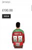
Having seen the reaction on social media before seeing the actual logo when I did see it my first thoughts were “ Oh it’s not that bad thank god”.
I remember the reaction to the change in the 90s was pretty bad and that was before the days of social media. And once someone pointed out that it looked like a devil taking a dump you can’t unsee it.
So in that respect the new logo is arguably better than the last one. It’s just a bit…..dull. I know the fashion these days is for everything to be minimalistic but I do fear it wont stand out and will just blend in to all the other non-descript logos in world sport.
Maybe it will grow on us. And if it doesn’t they change it back - which means these jerseys will become collectors items…..