3rd August
- Thread starter Wannabe2
- Start date
So...um...got back home and read a few of the replies on social media and took the whole thing in. Bear with me, this may take some time to get off my chest:
First off I totally get the build up and the hype and the potential for a 'I was there' moment, when something that big drops - but the logo is a massive let down.
Probably easier I go in chronological order...first thing I noticed was that we have sold every inch of the ice to any massive logo we can. It looks really, really bad, like Steelers levels of 'what-the-F***'-ery. Walls in the arena have had a freshen up with paint, toilets in red, looked smart. New away seats in black. All other seats look like they have either had a deep clean or someone go round with a flamethrower to bring up the oil.
Gantry expansion in the corner could well be a Comms box, or more likely a commercial space/box maybe? That looked good for a work in progress. But what stole the show was...
The logo: everybody has covered it. Its awful. Trying to put a positive spin I could say I look forward to it maybe growing on me...or more likely I'm glad I don't have to worry about buying a jersey etc next season. TK did spend a lot of time giving credit to all the guys at Limegreen Tangerine who designed the logo and did all the re-branding (I liked the video!)
Players: not a surprise given everything on here recently. I think this means with Jardine not coming back that we will have 2 left handed D and 4 right handed(?). Chad is a decent spare to have and will push players for a place on both D and F - so the likes of Batch and Crandall will keep a eye over their shoulder. For me, it may well be an unpopular opinion but I'm not fussed about Mosey - he needs to burn a Steeler jersey at centre ice or something for me...hes tainted now. Just a mercenary, like Blair Riley was.
Jerseys: thankfully I won't need to decide to sponsor one or buy one, not with that logo. I don't personally like the pitchforks at the bottom of any of the designs, I'm ok with the stripe effect tbh (didn't think I would like it). They remind me of CHL jerseys from a few years back. On the website the font for the names and numbers appear too big for the jersey and stick out a bit - didn't see that on the actual jerseys earlier. Not a massive fan of the squared off numbers, the fade on the red jersey numbers (which are green/white) is nice but not as nice as the fade on the old skyline jerseys. The switch back to a hybrid stitched/printed jersey is cool but the prices are insane - £130 for a reproduction jersey (i.e. its the same but not game worn) compared to £70 for a fully printed one. Nice to have the option but...thankfully the logo seals it as not something I need to think about.
Round off the numbers and make the font and numbers slightly smaller, ditch the pitchforks at the bottom, and go back to yesterday's jersey and they would be nice tbf....I could even live with the pitchforks.
I am actually dreading that the ST holder jersey will be green - because I have every green jersey (I think) made, or at least released since 2014 or so - and I don't want one of these.
Found a positive: at least they spelled 'Construction' correctly this year
The logo distracts from the horror that is the ice pad.
Edit: Think @lloyd_jeff has nailed it with the new profile pic
Very very rare Todd in recent times will say he got it wrong
There have only been a couple of times when Todd/club have got something wrong in recent years and each time they have held up their hands and admitted it and apologised over it.
unless there are examples I’ve forgotten?
I'd be interested to hear the decision behind the logo refresh. What was it about the old logo that held us back and what is it about the new one that gives us an advantage?
I think it's a huge slap in the face of the history of the Devils. The logo was iconic. This is a cheap imitation that represents nothing. It stands for nothing. It's turned us into a laughing stock.
I think it's a huge slap in the face of the history of the Devils. The logo was iconic. This is a cheap imitation that represents nothing. It stands for nothing. It's turned us into a laughing stock.
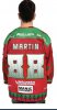
Whoever designed the shirts obviously heard someone from the club say “We’re hopeful the players will all put up really big numbers this season” and decided to take this literally to the point of insanity. Gantry sized numbers. Numbers so vast on the back of Devils they are visible from the international space station.
Thread starter
#233
Really?
I remember a lot of fans being furious with it. Some were even asking if Shannon Hope had designed the new logo and if so he should be sacked as a player.
I remember a lot of fans being furious with it. Some were even asking if Shannon Hope had designed the new logo and if so he should be sacked as a player.
Some of the NHL teams have very simple logos that reflect the identity and history of that club...Nashville, Buffalo, Arizona ,Calgary, Anaheim, Philadelphia. Beautifully done, instantly recognisable.
Thought our existing logo (well, the one prior to 7pm tonight, and we've had for over 20 years) incorporated those qualities.
Thought our existing logo (well, the one prior to 7pm tonight, and we've had for over 20 years) incorporated those qualities.
Last edited:
Thread starter
#236
I’ve just noticed the back of the shirt, who the hell designed that font for the numbers? It must be an early April fools joke, you couldn’t make it up just how bad this logo and design is.
I’ve just noticed the back of the shirt, who the hell designed that font for the numbers? It must be an early April fools joke, you couldn’t make it up just how bad this logo and design is.
Horrendous marketing balls up! Should be studied at Universities throughout then world for decades to come as a shining example of an unwanted and unneeded complete marketing disaster!
Of course he is. But there’s still a few around who remember what really happened!
I can remember a lot of the fans who I knew and sat by not being happy about it.
But of the people you knew and spoke to about it, there weren’t any complaints.
We can both be right as I’m fairly certain neither of us knew every Devils fan back then.
That’s a bit insulting isn’t it?
I can remember a lot of the fans who I knew and sat by not being happy about it.
But of the people you knew and spoke to about it, there weren’t any complaints.
We can both be right as I’m fairly certain neither of us knew every Devils fan back then.
I can remember a lot of the fans who I knew and sat by not being happy about it.
But of the people you knew and spoke to about it, there weren’t any complaints.
We can both be right as I’m fairly certain neither of us knew every Devils fan back then.
But keep on exaggerating if it makes you feel better.